
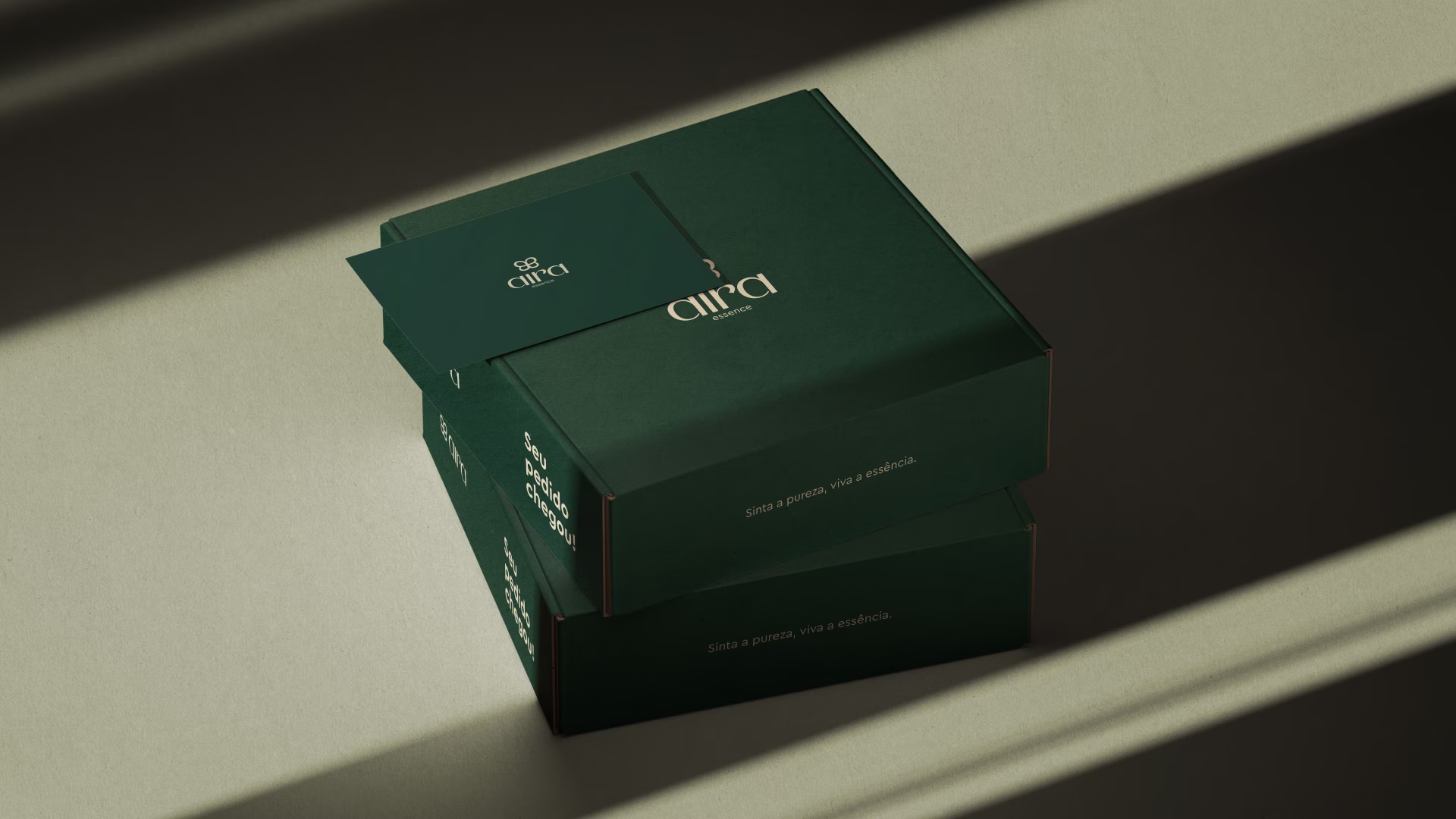
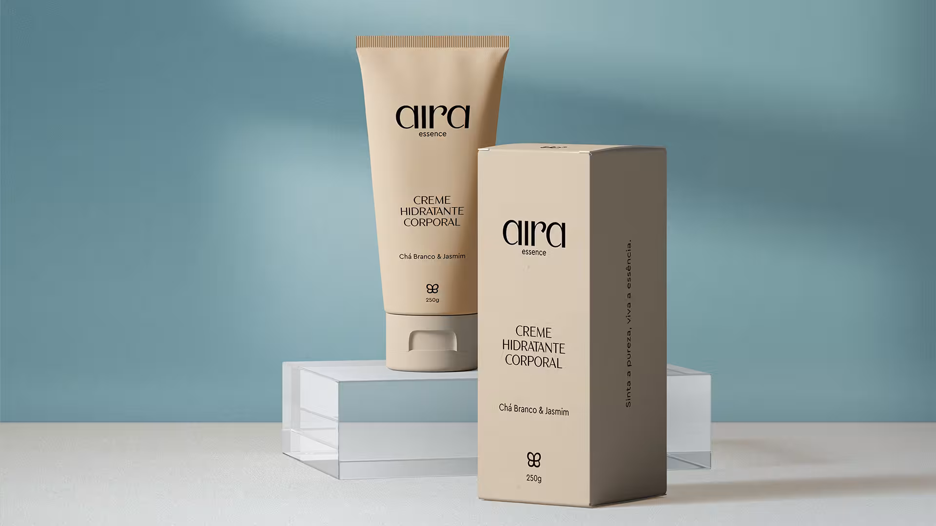
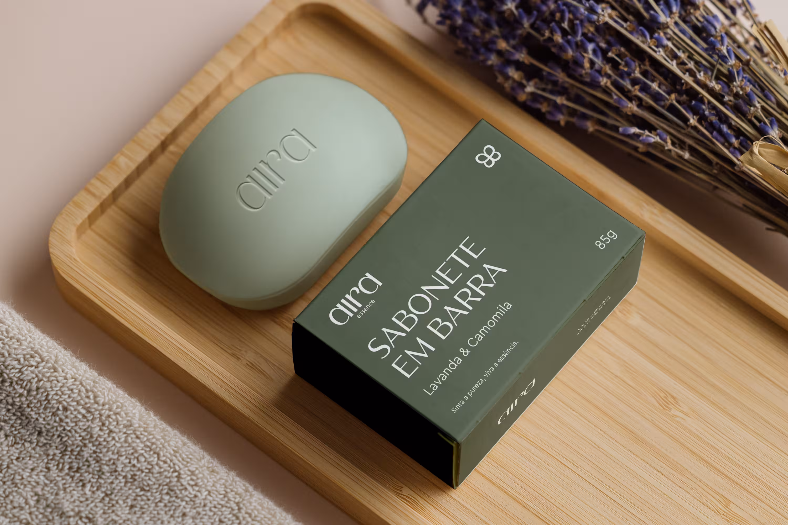
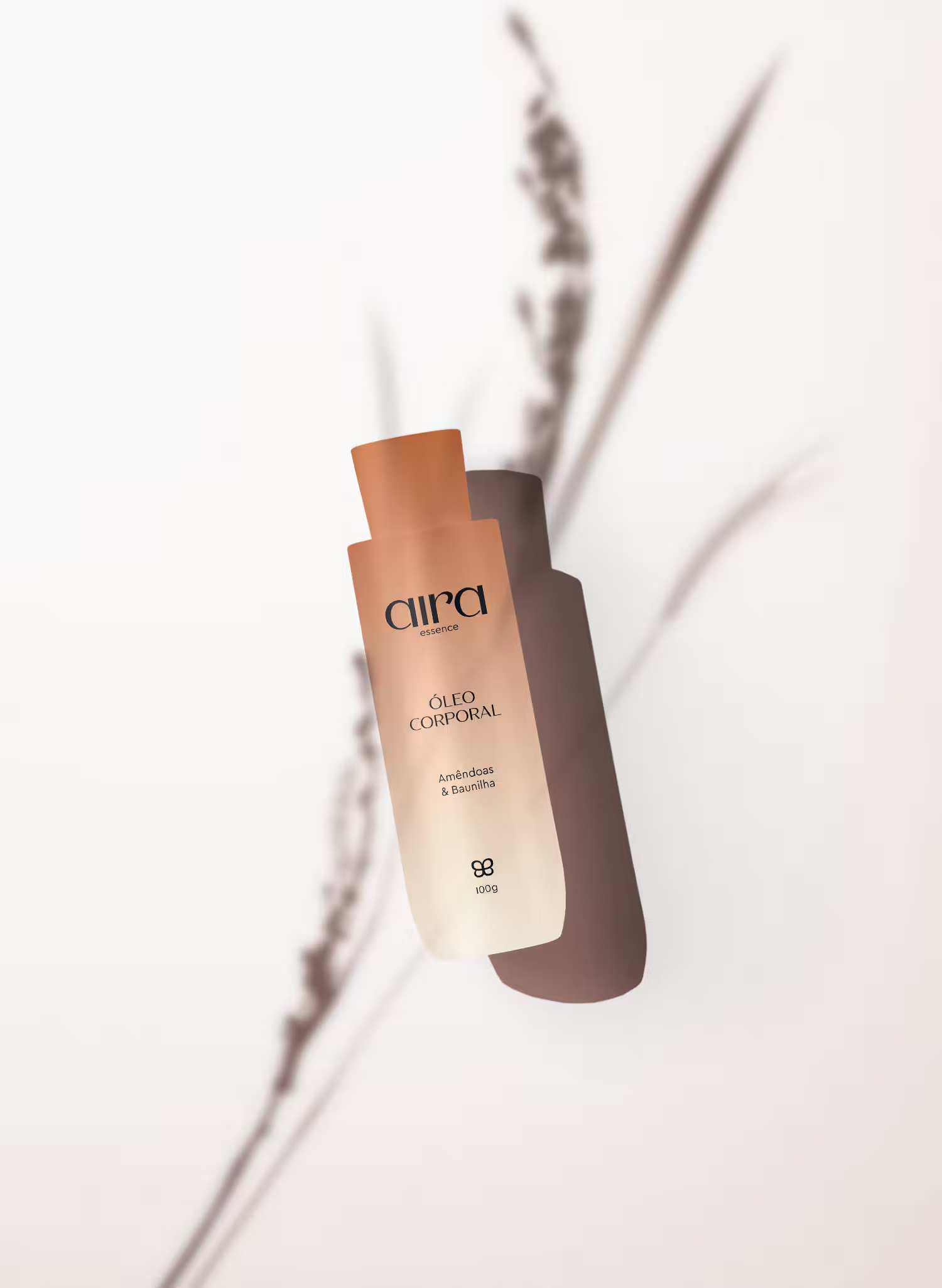
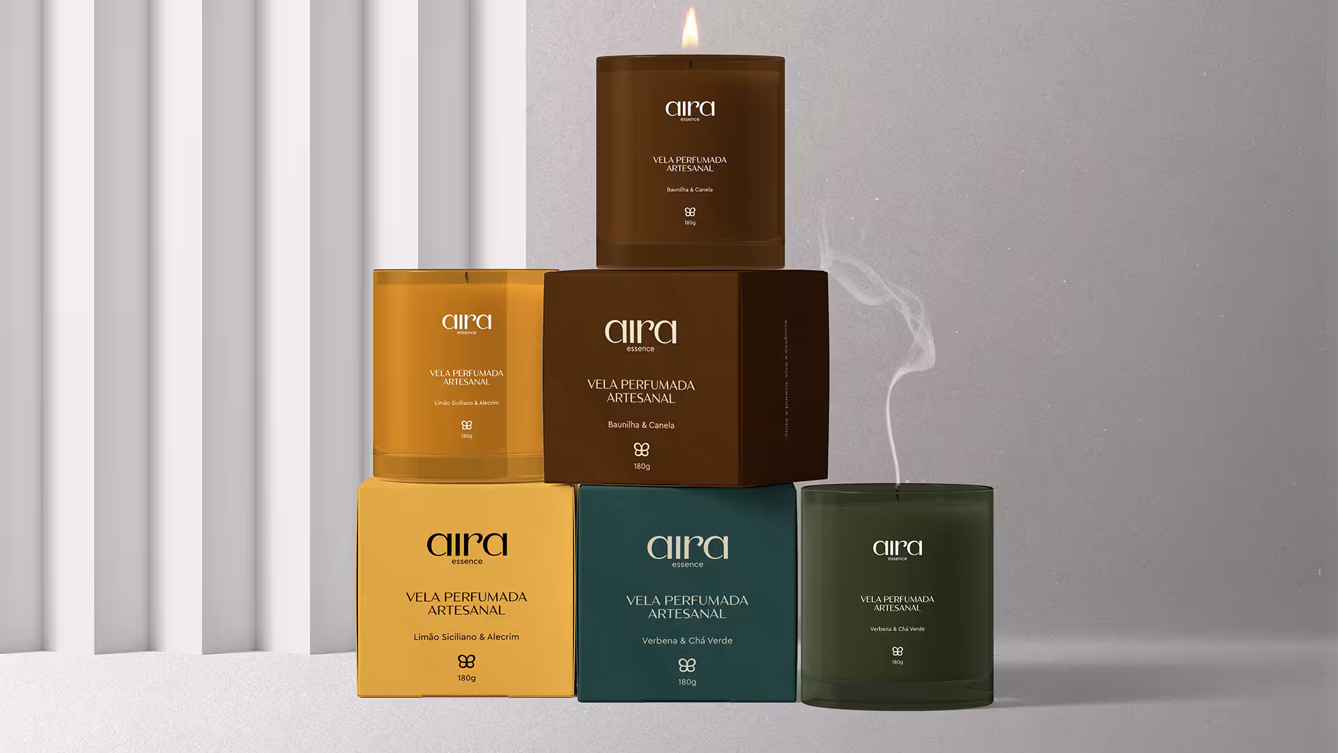
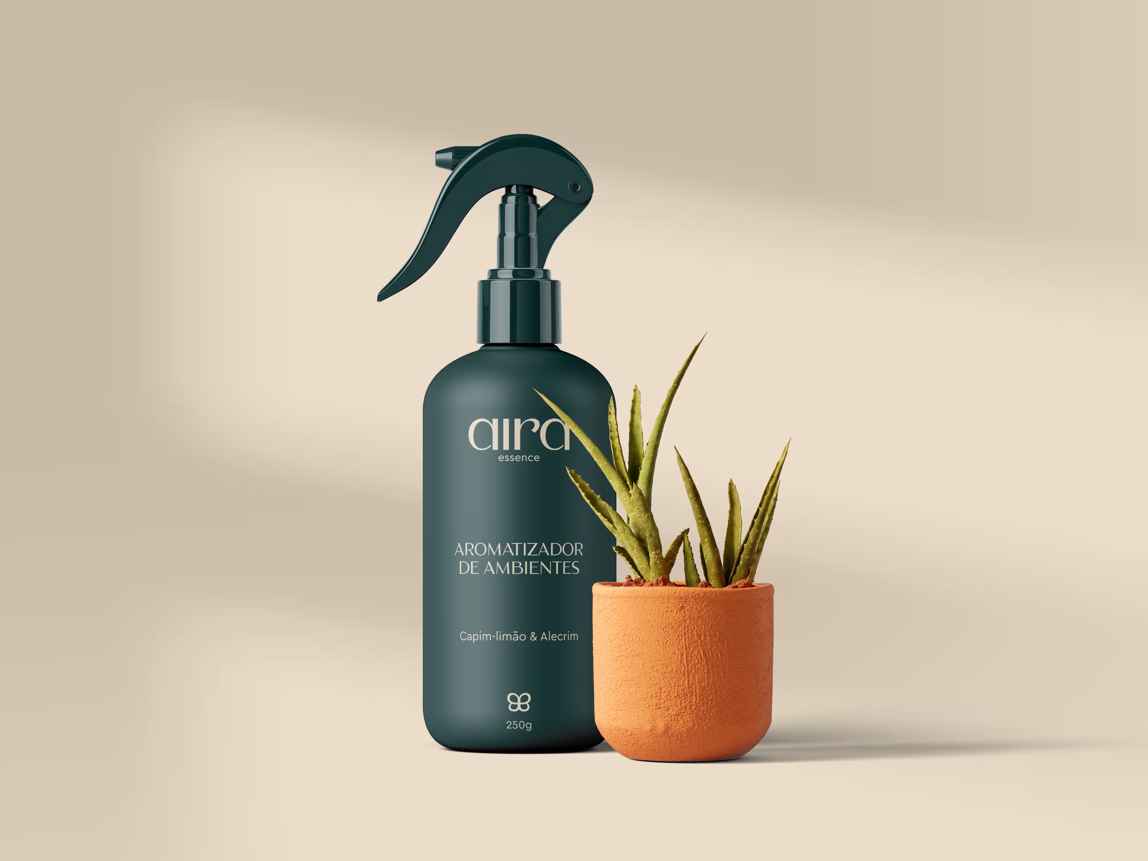
Aira Essence
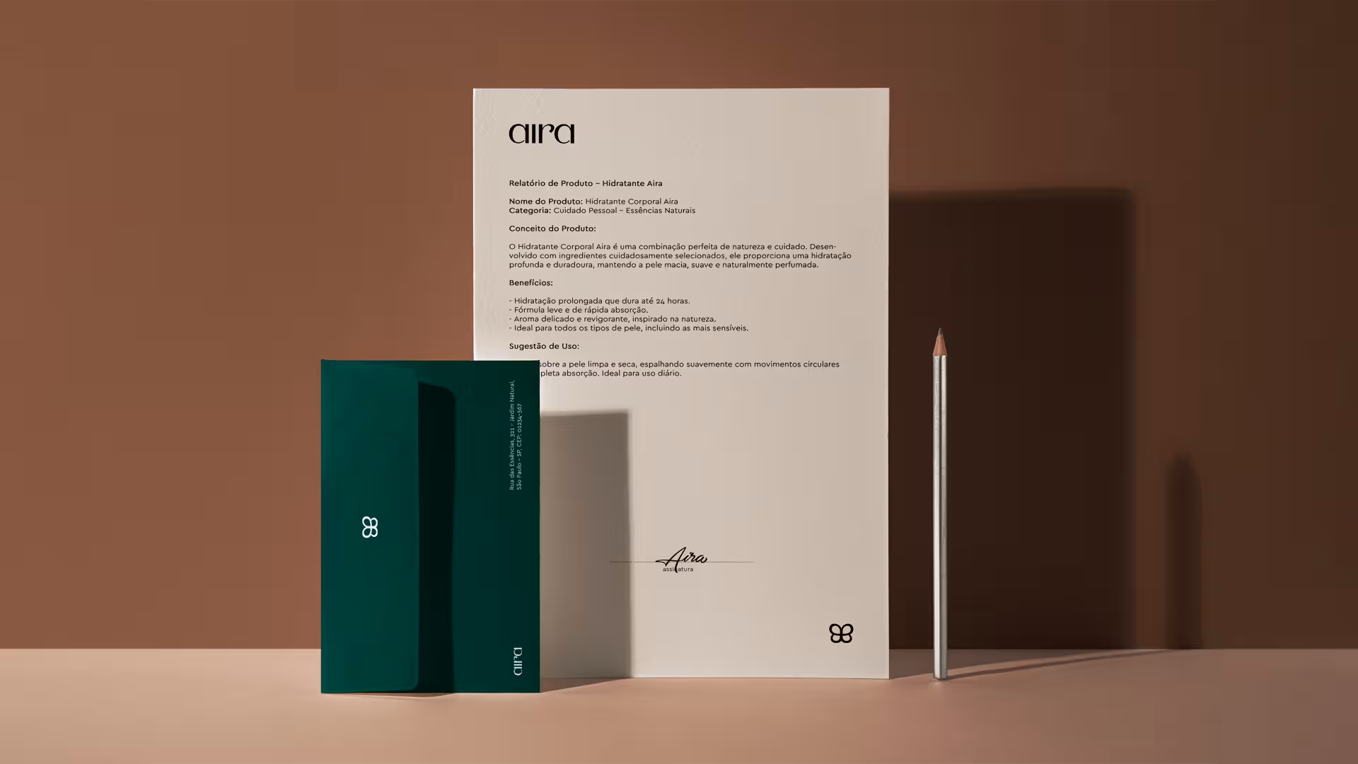
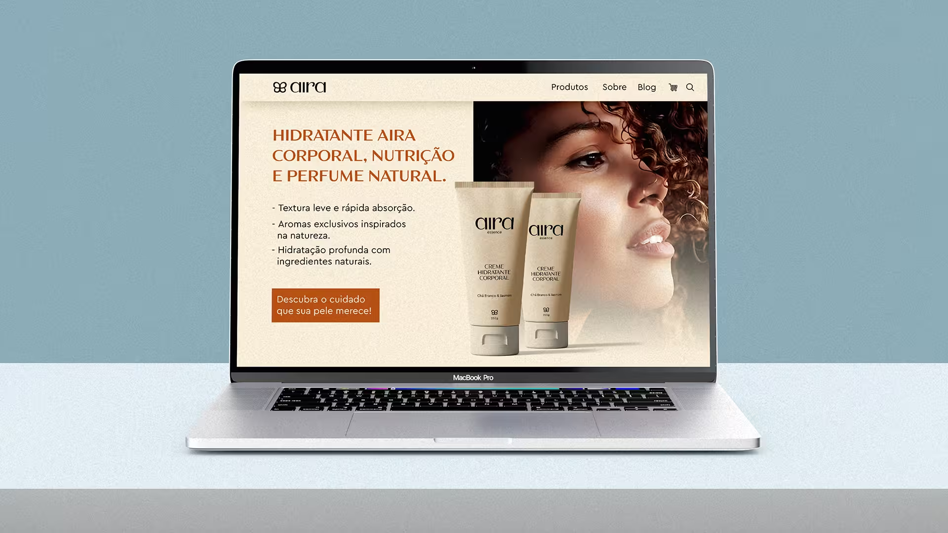
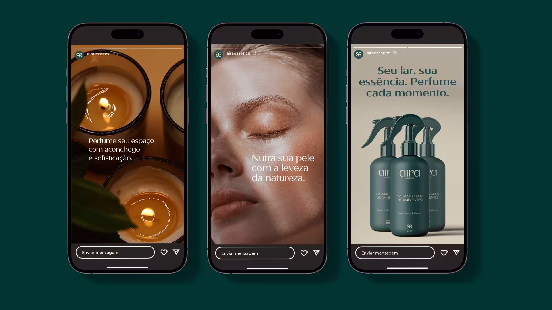
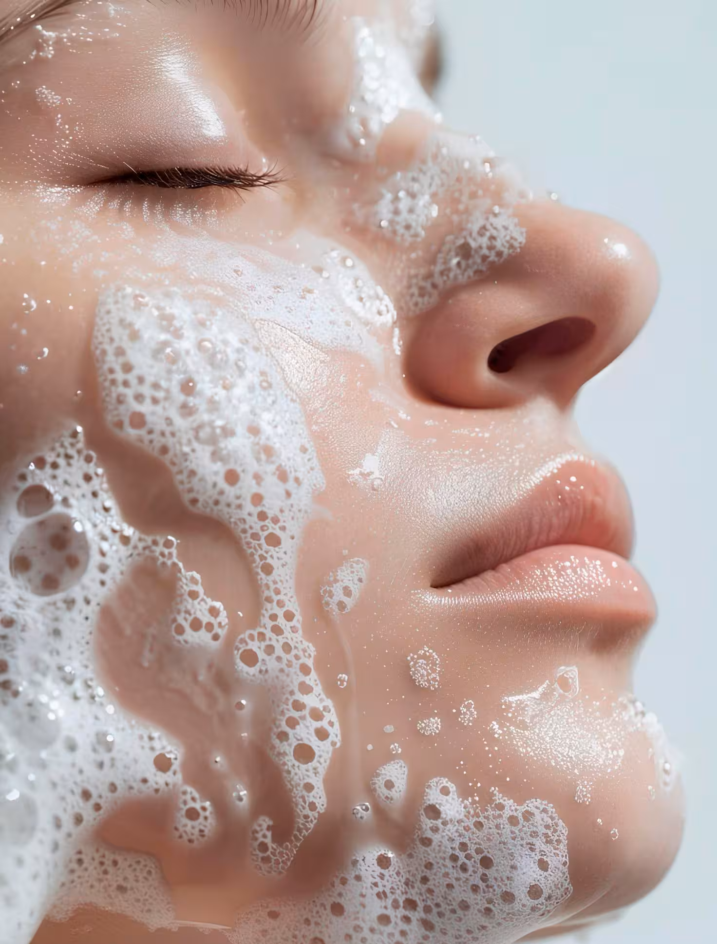
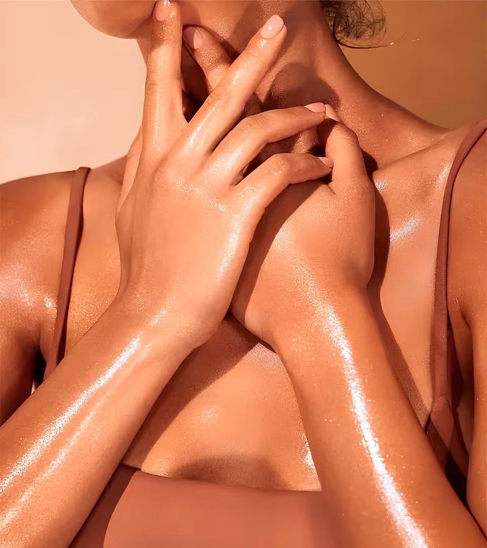
Aira Essence is a brand dedicated to providing well-being through carefully developed products with natural ingredients and captivating aromas. Inspired by the connection with nature, Aira seeks to transform small moments into unique sensory experiences, bringing lightness and balance to everyday life. With a complete line that includes body moisturizers, bar soaps, and aromatherapy sprays, Aira values simplicity, comfort, and sophistication. Each product is designed to create an atmosphere of care and tranquility, combining quality and authenticity.
Project Challenges
The main challenge in creating Aira Essence's visual identity was balancing sophistication with lightness, conveying the brand's essence in a clear and impactful way. It was fundamental to create an identity that reflected the concept of well-being and connection with nature, while maintaining a minimalist and elegant look. Another challenging aspect was developing visual elements that communicated the purity of the natural ingredients without losing modernity and aesthetic appeal. The choice of name, symbol, and color palettes needed to reflect both the delicacy and strength of the products, resulting in an authentic and inspiring brand.
Creating the Name
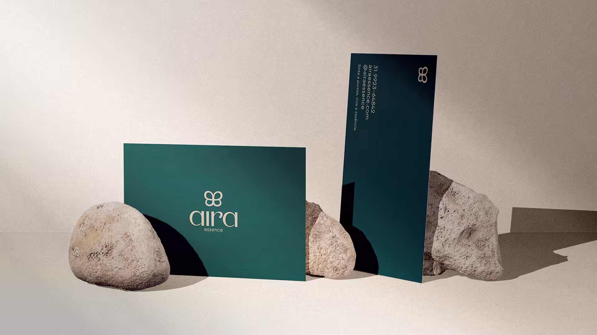
The choice of the name Aira Essence was inspired by the search for a word that conveyed lightness, naturalness, and a connection to well-being. The term "Aira" refers to the softness of the air and the freshness of nature, reflecting the essence of the brand's products. The addition of "Essence" reinforces the concept of purity and authenticity, key elements for a brand that values natural ingredients and moments of self-care. The name was carefully selected to be sonorous, elegant, and easy to remember, creating a strong and timeless identity. Aira Essence thus translates the proposal to transform small moments into unique sensory experiences.


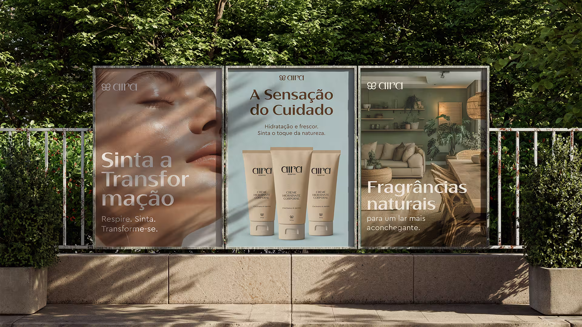
Colors
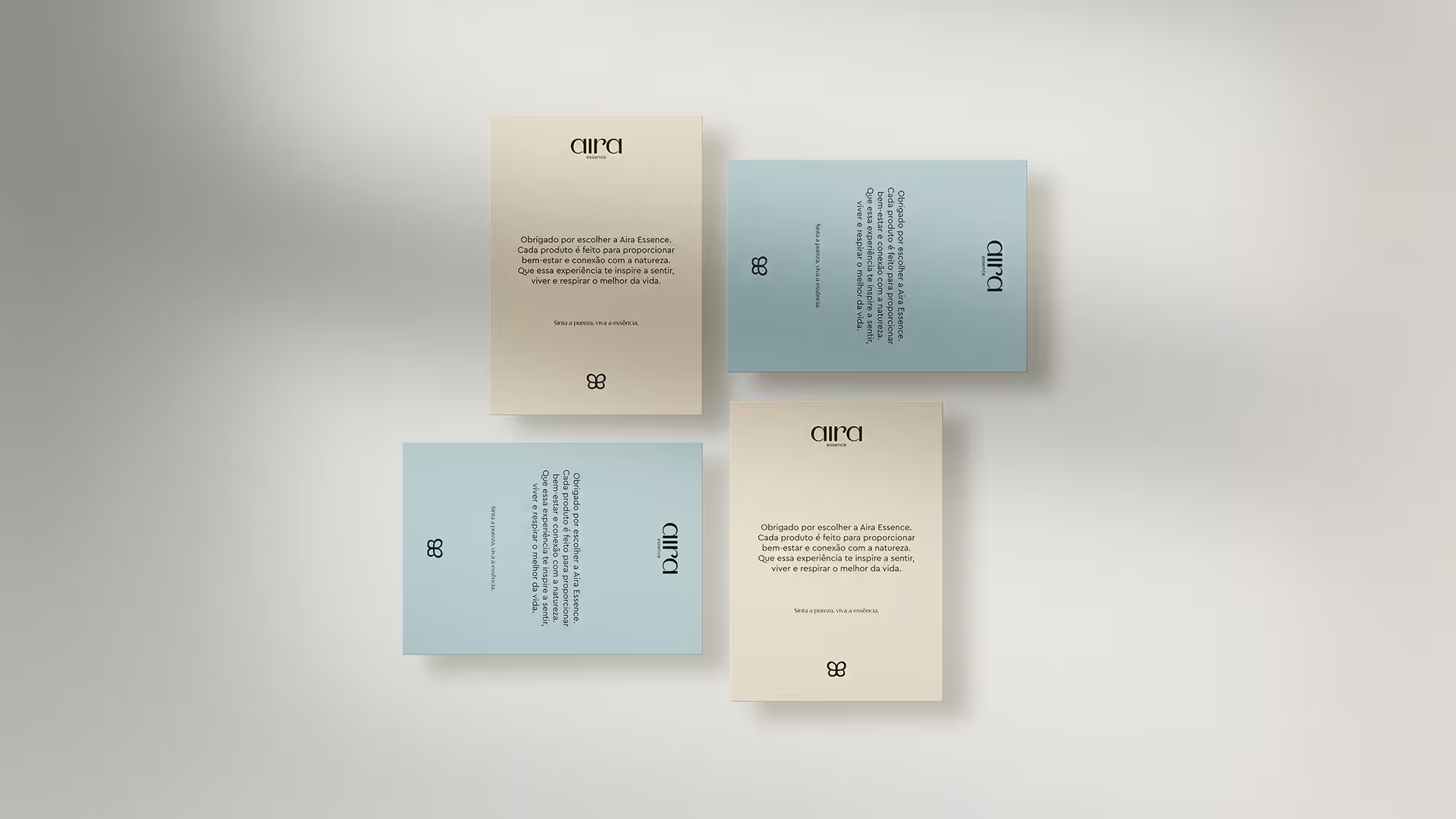
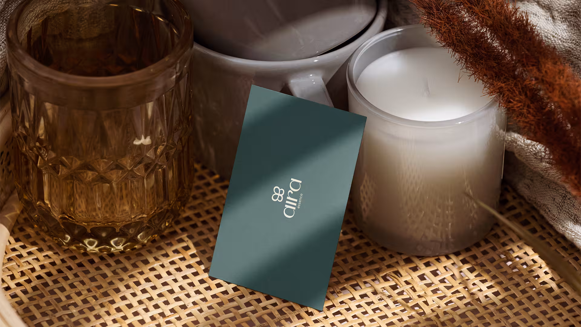
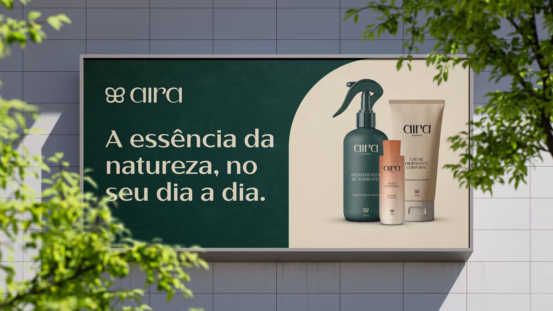
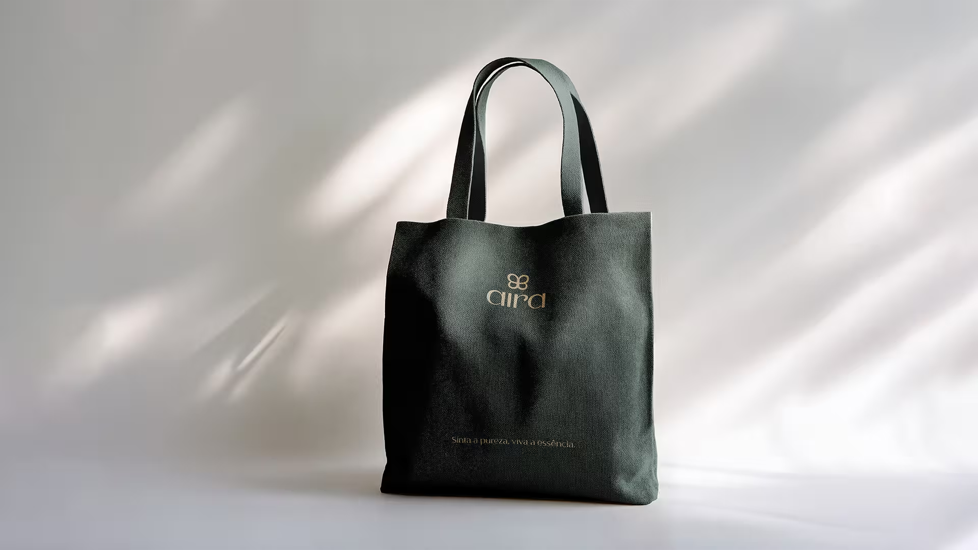
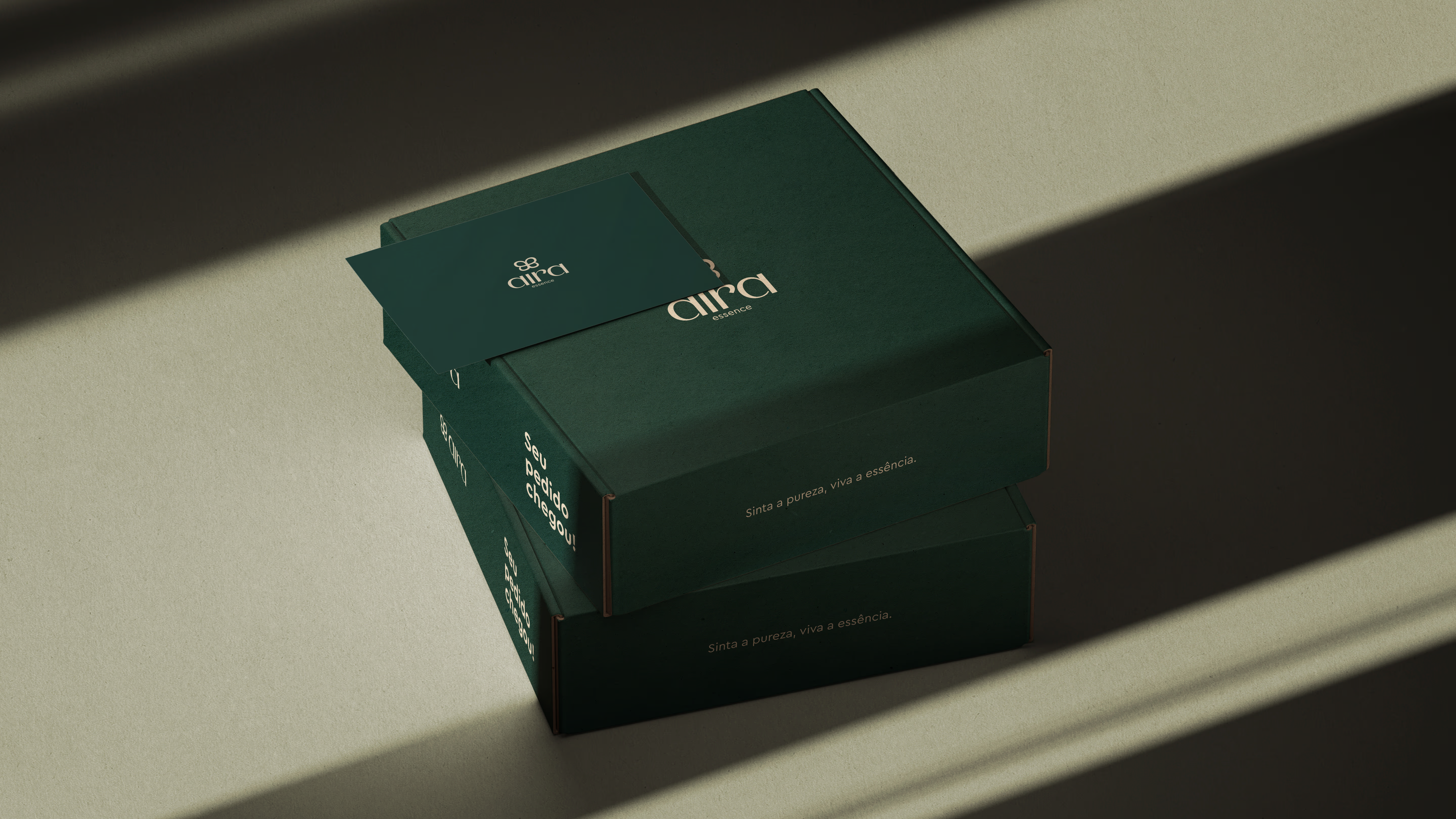
The Aira Essence color palette was chosen with the goal of conveying serenity, naturalness, and sophistication. The soft and balanced tones reflect a connection with nature and promote a sense of well-being. Green, the predominant color, symbolizes freshness and vitality, while the neutral tones reinforce the elegance and simplicity of the products. This chromatic composition creates a harmonious visual identity that resonates with the concept of lightness and care that the brand represents.
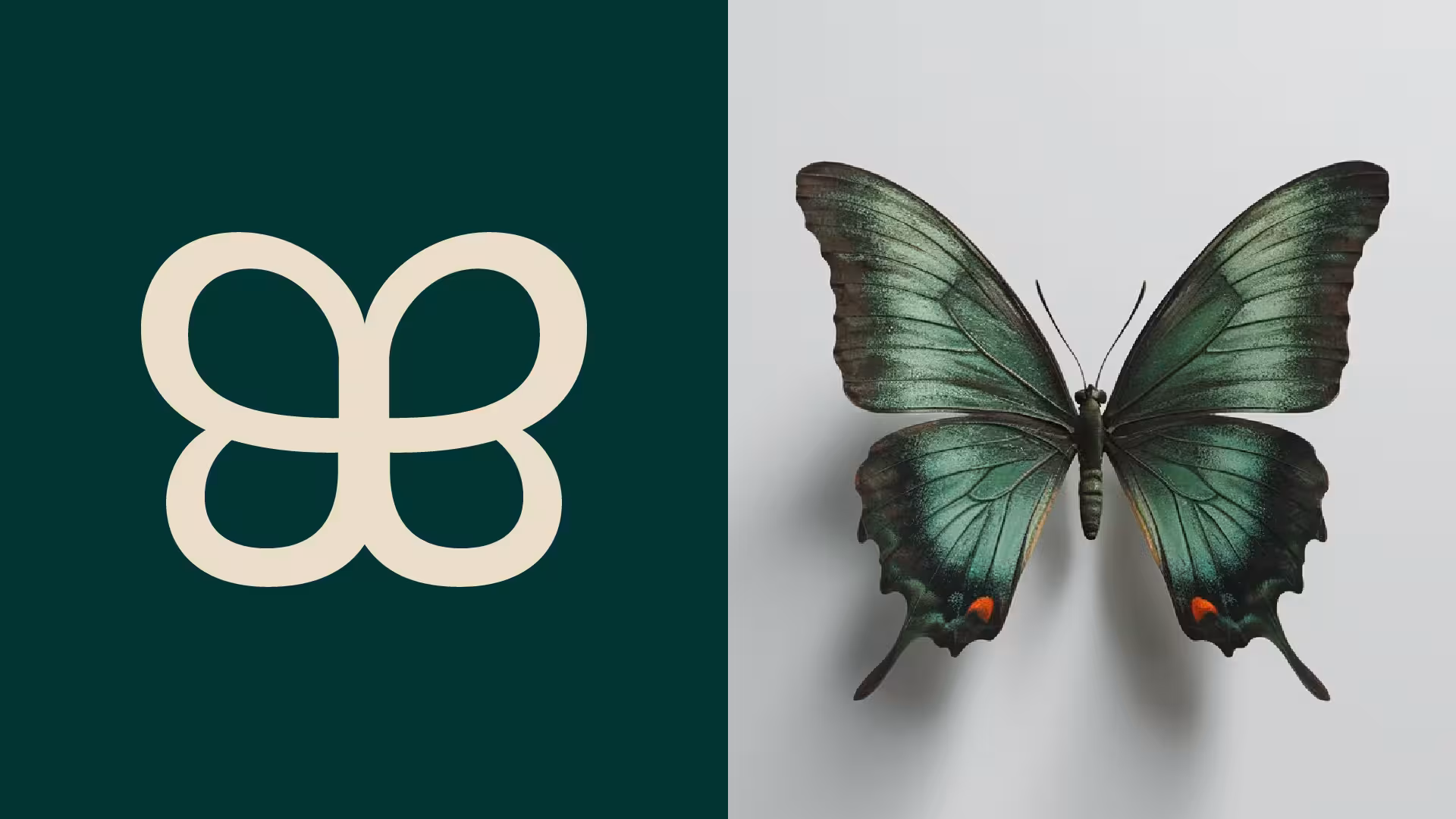
Brand Icon
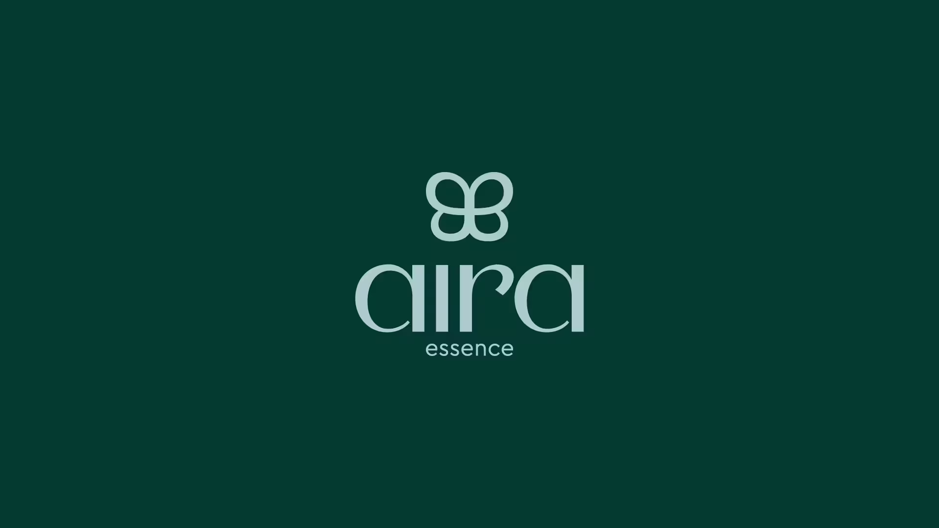
The Aira Essence icon is a stylized butterfly symbolizing transformation, lightness, and natural beauty. The choice of the butterfly reflects the brand's mission to provide moments of care and renewal through its products. Just as the butterfly undergoes a process of metamorphosis, Aira Essence seeks to transform routine into a sensory experience that awakens well-being. The minimalist design of the icon ensures modernity and elegance, maintaining a light and sophisticated visual identity. This visual combination conveys the essence of the brand: natural, captivating, and full of life.


Ready to transform your brand
into something strategic,
solid and memorable?
Fill out the form so we can better understand your project's objectives and schedule a strategic conversation.